Matching is only the start.
I wanted to explore what happens between finding someone on an app and feeling comfortable enough to meet. Choosing photos, writing a profile, and keeping a chat going can all add pressure.
My starting idea was a small-group activity, followed by a private choice about whether to express interest in someone. People would have something to do together before deciding whether to date.
I’d worked on products that match job seekers and employers. That made me interested in a similar question here: what does the experience need to offer beyond a match?
My independent master’s project.
I developed the concept, carried out research, mapped opportunities, created personas and flows, and tested prototypes. The work focused on interaction and usability, rather than launching a dating service.
People wanted it to feel more natural.
I combined background research with a short online survey and informal conversations. People talked about impersonal exchanges, pressure to present themselves well, ghosting, and chats that never led to meeting.
They used words like authentic, safe, natural, and spontaneous. I wanted to see whether shared interests and activities could help people feel more comfortable getting started.
“I want to meet people in a way that feels more natural and less like a job interview.”Informal conversation quoted in the project presentation
This was exploratory research. It helped me choose what to test, but I wouldn’t generalise these findings to everyone using dating apps.
Map what people need.
Decide what to test.
I used an opportunity solution tree to organise possible responses to the research. I focused on emotional safety, spontaneity, less pressure around profiles, finding activities, and helping people start a conversation.
I also created three personas to explore different comfort levels: a socially active professional, a cautious introvert, and an adventurous student. I used them to consider needs that might differ from my own.
The Double Diamond helped me structure the project. I kept gathering feedback as I worked, rather than treating research as a stage to finish and leave behind.
Prototype the first steps.
Find out what makes sense.
I planned three journeys: signing up, discovering an event, and joining an event before expressing mutual interest. I used low-fidelity prototypes to test the order and wording before spending time on the visual design.
I’d assumed people would register before exploring. In testing, they needed me to explain the group-dating idea before they could decide whether to join.
“I didn’t really get the group dating idea until you explained it—a quick walkthrough would help.”Usability participant quoted in the project presentation
Let people browse first.
Give them a reason to sign up.
Rather than adding more explanation to sign-up, I changed where the app started. People could open Discover and browse events without an account. They could see what Flicker offered before deciding to join.
Earlier direction
- Create an account
- Complete onboarding
- Understand the concept
- Discover events
Revised direction
- Discover events
- Explore interests
- Learn in context
- Sign up when ready
The For You and Connections tabs explained what would appear there once someone joined. A floating sign-up option stayed available while they browsed.
Screenshots from my presentation video. The image quality is limited by the recording.
Organise events by interest.
Make the list easier to browse.
The early design put every event in one feed. Participants wanted to find activities they were interested in without going through everything, so I added category filters.
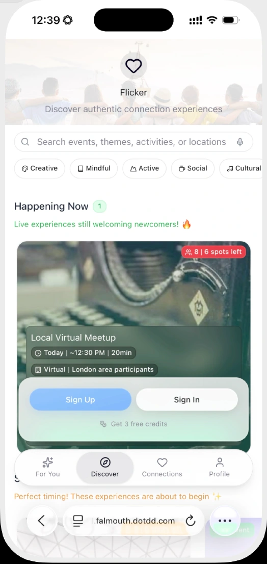
- Events come firstPeople see examples of what they could join.
- Filter by interestCategories help narrow down the list.
- Sign up when readyRegistration stays available without blocking browsing.
The idea made more sense. There was still more to explain.
In follow-up testing, participants said they understood the concept more quickly. They liked browsing before signing up and found the categories helpful.
“I like that I can browse without signing up—I feel more in control.”Usability participant quoted in the project presentation
They also wanted more event details, clearer information about hosts, examples of activities, and ways to break the ice before a session.
A clearer introduction to Flicker.
The feedback helped me understand how people used the prototype. I didn’t test real-world match rates, long-term use, or whether the concept led to relationships.
I didn’t need a longer introduction. I needed a different starting point.
I began by trying to explain the app during onboarding. Letting people browse examples of events did that job more clearly than another explanation screen.
With limited time, I focused on onboarding and discovery rather than trying to finish every part of the concept.
What I developed
Research, opportunity mapping, personas, early flows, and tested mid-fidelity onboarding and discovery prototypes.
What I’d test next
Joining an event and expressing mutual interest. I’d also add event details, test with more participants, and develop the visual identity and higher-fidelity screens.
The question I’d keep asking is simple: does someone understand enough to want to try this?
About the source material
- Project Flicker presentation, final submission, August 2025.
- Project Flicker presentation recording; original prototype demonstrations at 6:03 and 6:12.
- GDO751 Major Project Reflection, Didier Ma, August 2025.
- GDO751 Major Project Proposal, Didier Ma, May 2025.