I love prototyping, and I love rapid ideation. These are the best design tools to validate designers’ ideas and solutions without the additional overhead to engineer the real thing. In my opinion, rapid ideation can help bring concepts to reality in a very low-cost way, yet, expensively valuable.
This week’s topic was about prototyping to generate ideas and use prototypes to validate solutions rapidly. I love the many prototyping techniques introduced in this module, from low fidelity paper prototypes to high fidelity code-based prototypes. Whatever way you take, it’s all about getting the ideas out quickly, interactively, and visually to share with your stakeholders. For example, it could be a prototype to share with your team and explain your design’s rationale. Or, it could be a demo prototype to discuss with your engineers in the group to understand if there are any missed edge cases or technical constraints. It could also be a prototype that could be used in user research to validate your hypothesis.
We were asked to choose one or two of the prototyping methods outlined this week and build quick prototypal representations of your chosen artifact.
It so happened that this week I was investigating a usability issue of a social impact project I am part of. The app is called Socious, which helps connect people to collaborate in projects to bring positive changes to humankind or our planet. I wanted to understand if there were any issues with the navigation. I used Figma to create a prototype to run some user research sessions to collect qualitative feedback.
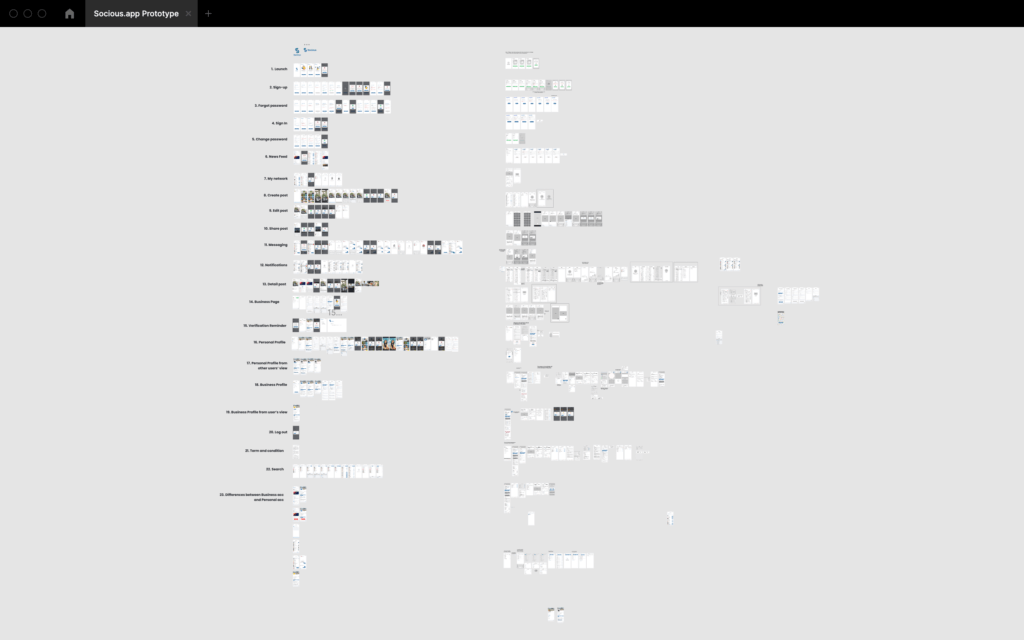
This is the design I received with all the screens already in place:
Next, I needed to focus on the area I wanted to test, i.e., the app’s bottom navigation bar:
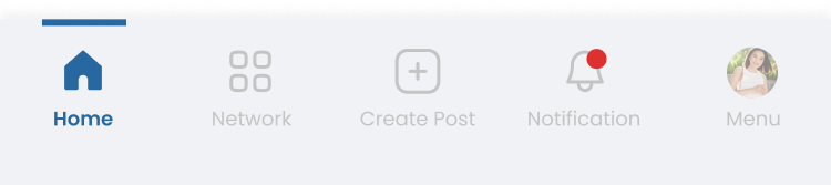
I started with the critical screens I needed for our users at the research sessions to share their thoughts. So I opted in the start page of each category. I also linked the onboarding screen to get users familiar with the idea of the app.
I learned from this process that many options in Figma can help you prototype more effectively.
- After Delay: It helps you to create a realistic loading state. Instead of quickly jumping between screens, adding delayed loading time can help users feel the prototype is as actual as of the real app.
- Components: I learned from this exercise that links in Figma Component are shared across all screens. Instead of manually linking the same screen to different screens, creating components can speed up the process. A link created for that component will also be automatically applied to other screens with the same element.
- Hidden Hotspot: This is important! By default, the Figma prototype displays some visible hotspots to let your know what is clickable in the prototype. However, that could also hint at what is tappable, and the users will knowingly tap on those hotspots if they miss what they are supposed to tap.
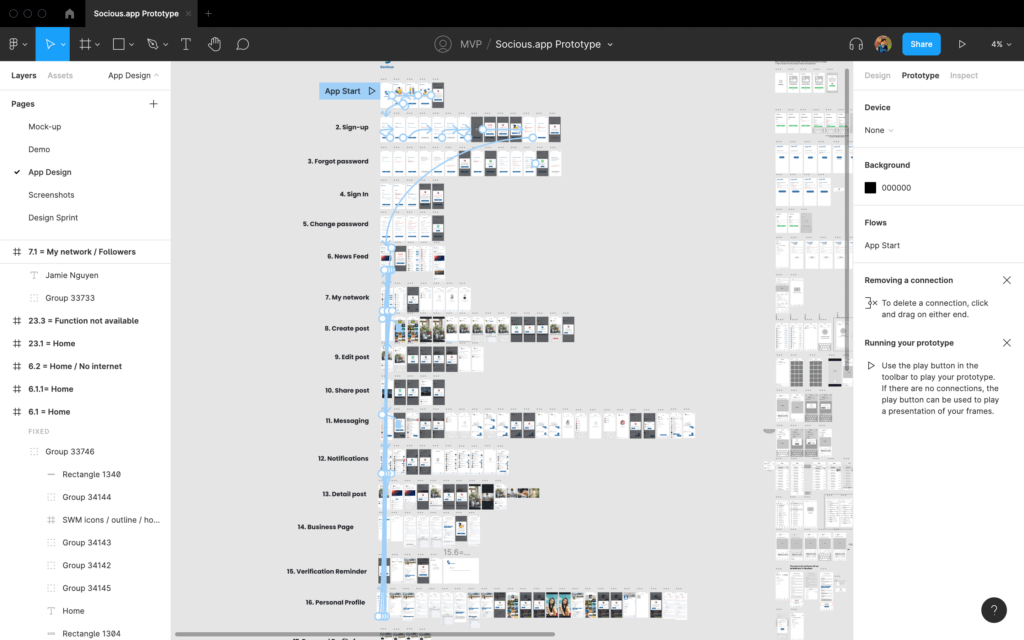
This was the prototype I created to use in the research (hotspots enabled):
With this prototype and research sessions, I collected valuable feedback from our users and informed potential fixes.
Iteration 1:

Iteration 2:

I made a few changes to the original design. Each iteration had allowed me to understand our user’s mental modal and how I could iterate the design to address the usability issues.
To conclude, rapid ideation and prototyping can help designers quickly iterate on their ideas and validate their hypotheses at a low cost. This is a practice that (I think) all designers should do.