Colour
Choose a token by what the colour does. The same name follows the system, light and dark appearances. Set surfaces and text together so their relationship holds in both themes.
| Token and use | Light | Dark |
|---|---|---|
--bgPage background | #F5F3ED | #121514 |
--surfaceGrouped content | #EAE8DF | #1C211F |
--raisedRaised controls and panels | #FCFBF6 | #262C29 |
--inkPrimary text | #202824 | #EAF0E9 |
--mutedSupporting text and labels | #626C65 | #ABB6AD |
--lineBorders and dividers | #D6D9CF | #38433B |
--accentFocus and active states | #245E78 | #94C5D8 |
--markerHandwritten emphasis | #CBDCDA | #344E4C |
Usage rule Pair the active colour with an underline, icon, label or other visible state. Keep the original colours in product screenshots.
Typography
Use one level-one heading to name the page. Give each section a heading that tells the reader what they’ll learn. Let line breaks adjust to the available width.
--displayWhat changed
EB Garamond for page titles, story headings and the wordmark.
--hand
Bring people along.
Caveat for short emphasis or a personal annotation. Use it where a change of voice helps.
--sansExplain what happened and why.
System sans for body copy, labels and controls. The base is 16 px with a line height of 1.6.
--terminal-monoAsk > How does it work?
Monospace marks the Ask interface. Keep it for chat, prompts and code.
Usage rule Handwriting scales to 1.14em in headings and 1.23em in case-study decks. Let the phrase wrap and keep the full text readable during the reveal.
Layout and shape
Use the shared .wrap for page edges and let the content grid stack as space narrows. Keep related items close together. Give a new story section enough space to read as a new chapter.
Spacing scale
--grid-unit- 4 px
--space-2- 8 px
--space-3- 12 px
--space-4- 16 px
--space-6- 24 px
Nested corners
Use the shared stepped geometry for controls and panels. For an inset control, subtract its inset from the outer frame radius so the curves follow each other.
- Controls
- Use the shared 44 px control height for primary touch interactions. Preserve a readable label at narrow widths.
- Corner tokens
- Standard buttons use
--button-radiusat 20 px. Panels start at 24 px through--radius-panel, with a small increase at narrower widths. Use squircle corners for shared controls and preserve the original geometry of product artwork. - Safe areas
- Use
--safe-top,--safe-bottomand--safe-inlineto keep fixed controls clear of device insets. - Section rhythm
- Let
--editorial-section-gapown the spacing between case-study chapters. The gap scales from 64 to 96 px.
Components
Use these examples as a starting point for labels, states and behaviour. Start with the existing markup and vary what the content needs.
Actions and links
Use a filled control at most once in an action group, such as the primary action on an application page. Use underlined links to move readers to other pages or sections. Use a button for changes on the current page, such as opening a dialog. State what is needed before a disabled action becomes available.
Icons
The monochrome icons were drawn to match EB Garamond, the primary display face. Tapered strokes, gently bowed edges and small flares echo the thick and thin forms in the letterforms.
Direction and navigation
Content and contact
Controls and appearance
Editorial arrows
Rotate the down chevron for open menus and disclosures. Pair unfamiliar icons with text. Give icon-only buttons accessible names that describe their actions.
Disclosures
About the source material
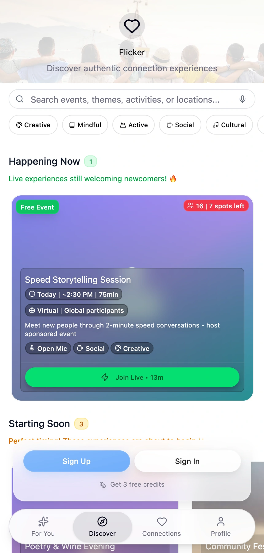
The prototype screens come from Flicker, my master’s project at Falmouth University.
Use a disclosure for supporting detail, such as source notes or credits. Name what’s inside in the label. Keep information that readers need to act on in the main text.
Section navigation
Components
Keep the current section visible when the menu is closed. Open the example to see how the active link is marked in the list.
Ask composer and conversation
- Waiting for a reply
- Answer with a source
- Unavailable
Project cards and media
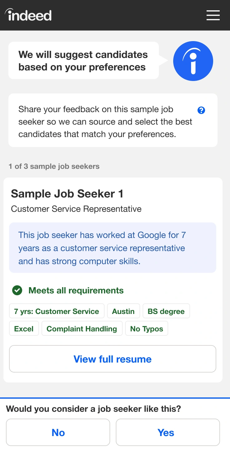
Virtual Recruiter
From a remote sprint to the employer experience.
Give each project card one destination and a short description of the work. Use recognizable screenshots and label what readers should notice. Use the shared viewer whenever detail would be hard to read at the inline size.
Page templates
Choose a template based on what the reader came to do. The wireframes show how each page groups its main sections.
-
Home
Introduce me briefly and give readers a clear way into work or personal content.
- Portrait and introduction
- Ask
- Work
- Life
- Selected work
- My story
- Contact
-
Work index
Help readers compare projects by showing the problem, my contribution, and a recognisable piece of the work.
- Work overview and résumé
- Responsive wireframe
- Project summary
- Project image
- Contact
-
Case study
Explain what changed and why. Place screenshots, prototypes, or diagrams beside the decisions they help explain.
- Project and contribution
- Section index
- Decisions and evidence
- Outcome
- Related work
-
Visual design collection
Group archival work by discipline. Use captions to give each project enough context for its images to be understood.
- Collection introduction
- Category index
- Project
- Gallery
- Contact
-
Life
Group personal interests into chapters. Give photographs room and keep the travel map controls with the map.
- Life introduction
- Section links
- Interest chapters
- Photos
- Travel map and credits
- Contact
-
My story
Use chapters to connect career experiences with how I work today. Keep the section index available as readers move through the story.
- Personal introduction
- Section index
- Career chapters
- How I work
- Contact
-
Résumé
Make roles, dates, and experience easy to scan. Keep the PDF action visible near the top and check the print layout.
- Name and profile
- Download PDF
- Experience
- Earlier roles
- Education
- Skills
-
Privacy
Use clear headings so readers can find the information they need about Ask, site analytics, and their choices.
- Privacy at a glance
- Ask
- Analytics
- Privacy choices
- Contact
-
Application landing page
Start with the role and why it interests me. Choose relevant work and carry the application context into project links and Ask.
- Note for the role
- Featured work
- Selected work
- How I work
- Contact and résumé
-
Design system guide
Use live examples for shared rules and link to real pages that show how the pieces fit together.
- Guide introduction
- Section index
- Foundations and components
- Templates and decisions
- Accessibility and maintenance
Patterns and motion
Use these rules when an interaction or a piece of content appears on more than one page.
- Global navigation
- Keep Work, Life and My story in that order. On narrow screens, show the current page and section in the compact menu. For long pages, put the section list in the sidebar on desktop and in the compact menu on mobile. Check that Back and Forward restore the page and reading position.
- Case-study evidence
- Use a standalone image for one screen, a side-by-side comparison for differences, and a gallery for related screens people can browse in order. Caption what the reader should notice. Offer Enlarge when the inline image is too small to inspect. For a short demo, keep the poster and a written description available with reduced motion.
- Ask and privacy
- Keep the launcher recognisable as it floats over the page, even when the inline prompt is empty. Explain what is sent before someone asks a question. Show progress and unavailable states in the conversation and keep email available as a direct way to get in touch.
- Contact
- Group email and LinkedIn as text links with matching icons. Let the links wrap or stack when space is limited. Keep Privacy and Privacy choices in the footer.
- Editorial copy
- Write link labels that name the destination. Separate my contribution from the team’s work and distinguish a prototype, a proposal and a shipped result. Credit collaborators and date archival examples when their context matters.
- Visual identity and motion
- Use the serif for headlines and handwriting for a short phrase that deserves emphasis. The CRT texture gives the portfolio its character. Keep it subtle enough to read through. In Selected work, the wireframes gesture at responsive layouts and the kinds of work behind the projects. Use movement to show continuity or change, and keep the same information available with reduced motion.
Design decisions
Four pairs of examples show how to keep controls clear, preserve continuity, present screenshots, and guide readers through Home.
Move the appearance switch into the mobile header
- Do
- Keep the appearance switch beside the mobile section menu. Place it above “On this page” when the guide has a sidebar.
- Don’t
- Don’t float the switch over the guide text. It can cover the line someone is reading.
Why Readers need the appearance switch within reach while comparing examples. The sticky header and sidebar both keep it available as they scroll.
Keep the header and Ask in place between pages
- Do
- Keep the header, CRT effect and Ask launcher in place when the main content changes. Give each page an address readers can open directly.
- Don’t
- Don’t restart the shared interface on every internal link. It interrupts the reader’s sense of place.
Why A stable header and launcher give readers a familiar place to go next. Restoring the reading position with Back and Forward lets them pick up where they left off.
Open the Work indexLet standalone screenshots sit on the page
- Do
- Show a standalone screenshot at its natural proportions. Place its caption and Enlarge action underneath. Use a panel to group related material.
- Don’t
- Don’t add a padded frame around every screenshot. A phone capture already has a visible edge, and extra framing leaves less room for the screen.
Why A screenshot is evidence. Using the available width makes details easier to inspect, and the caption guides the reader’s attention.
See the Flicker screensGive Home clear paths into work and life
- Do
- Introduce yourself briefly, then give readers clear paths into Work and Life. Follow with Selected work and an invitation to read My story.
- Don’t
- Don’t make professional work the only obvious path from Home. Some readers come for your story or interests.
Why Some people visit to see my work, and others come to see what I’m up to. Naming both paths early gives each reader a clear place to start.
See the homepage openingAccessibility
-
Keyboard and focus
Start at the skip link and tab through menus, controls and disclosures. Check that the focus ring stays visible and closing a dialog returns focus to its trigger.
-
Contrast and state
Check text against its surface in both themes. Use a label, icon or outline to identify selection, validation and error states alongside colour.
-
Reflow and touch
Check the layout at 320 px and zoomed in. Let long labels wrap, and make sure the sticky header and Ask launcher leave room to reach other controls.
-
Images and motion
Describe what the image shows in alt text. Put the context in the caption. With Reduce Motion enabled, check that the same information is still available in order.
Maintaining the system
-
Identify the rule
Start with a token or an existing component. Keep a project-specific adjustment with that project.
-
Update the source and example
Make a shared change in the common file, then update the corresponding example in the guide.
-
Verify it in use
Review a real page and the guide in both themes. Check keyboard navigation, narrow widths and reduced motion, then run
npm run checkfrom the portfolio checkout.
- Colour and type
theme-colors.csstypography.css- Spacing and controls
shapes.cssbutton-shapes.csseditorial-spacing.css- Navigation and Ask
case-menu.csschat.csspersonal-home.css- Media and motion
screenshot-presentation.cssink-reveal.csscrt.css